Artikel DJKN

Gestalt Principles; Ways to Make Your Data Visualization Count
Iwan Kurniawan
Selasa, 02 Mei 2023 pukul 12:44:03 |
1675 kali
Data visualization. Data visualization. Data visualization.
Data visualization is term we commonly hear recently. As we are accelerating towards data-driven decision making, we always have the urge to visualize set of data to understand data easier. Data visualization is one of ways to communicate your data to stakeholder, hence it really takes big part on how we show data analytics’ objectives are met.
As Dante Vitagliano once said, “Data visualization is the language of decision making. Good charts effectively convey information. Great charts enable, inform, and improve decision making.”
Data visualization aims to lead target audiences to focus on business insight of data related to objectives. After knowing the important of data visualization, we have to be more considerate about creating the most effective display for our data visualization. There are so many tips on creating data visualization, but in this article, we are gonna talk more about the visual and its relation with human psychology.
In graphic design world, there is a common principal designer usually apply, i.e. Gestalt Principles. According to Interaction Design Foundation, Gestalt Principles are principles/laws of human perception that describe how humans group similar elements, recognize patterns, and simplify complex images when we perceive objects. Gestalt principle is a set of guidelines that deal with how the human brain perceives the world around them: simplifying, organizing, and rearranging complex objects so that it can make sense to us better (Shikhrakar, 2020). Basically, gestalt principles are aiming to explain how we perceive things the way we do so that we can understand things easily.
This is some gestalt principles you can apply in your data visualization:
Law of Simplicity
Less is more. That quote really describes how we can apply law of simplicity in our data visualization. Our eyes always seek simplicity in complex things and our brain prefers to comprehend simple things with minimum cognitive effort, so instead of creating a complicated chart, it is better to make it simple. Practitioners should embrace techniques like sorting items, removing the use of multi-color, simplifying or reducing jargon, which can ease the cognitive burden (Deep, 2023).
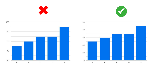
Figure 1. the right chart is more understandable than
the left chart (source: MySkill Bootcamp)
Law of Proximity
Law of Proximity states that we perceive objects as part of group when they are close to each other. You can use this principle by placing chart, filter bar, and title close to each other. It is vital to encourage viewers to scan given information quickly.
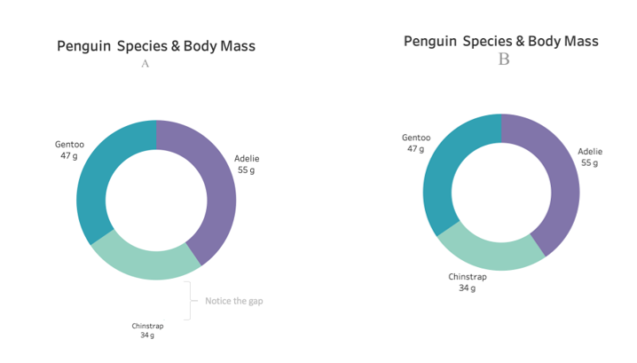
Figure 2. Chart B is more understandable than Chart A since
the labels in Chart B are positioned near the specific color of chart (source: https://medium.com/@maladeep.upadhaya)
Law of Similarity
In Law of Similarity, we tend to seek similarities and
link it into group. We usually perceive objects that coordinate similar
movement to be related. To apply this principle, we can use similar
characteristics and attributes (size, color, shape, etc.) to establish
relationships between objects.
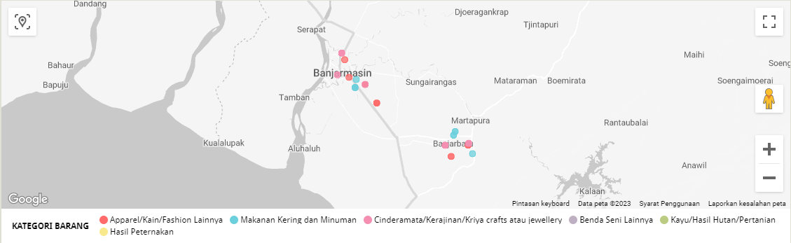
Figure 3. In this chart we use color to identify item’s
category (source: Kanwil DJKN KST’s MSME Auction Dashboard)
Law of Focal Point
If we want to emphasize specific insight, one of ways
to do it is to highlight specific part of the chart. It is easier for
stakeholders to understand what kind of information we want to convey through our
chart. Please do remember that elements that stands out will gain higher
attention.
To make focal point on chart, we can use techniques like highlighting or using unfamiliar shapes or colors.
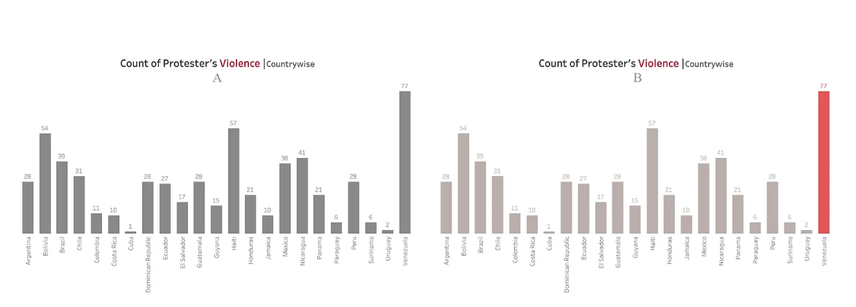
Figure 4. Insights are easier to be recognized in
Chart B than Chart A (source: source: https://medium.com/@maladeep.upadhaya)
Law of Figure and Ground
Figure and ground are used to differentiate perception of subject (figure) and its background (ground). The figure is things we have to focused on and its background should support the figure to get spotlight. Techniques we can use to implement this principle is by using light and dark color in contrast, but do not use shady color because it will only confuse viewers.
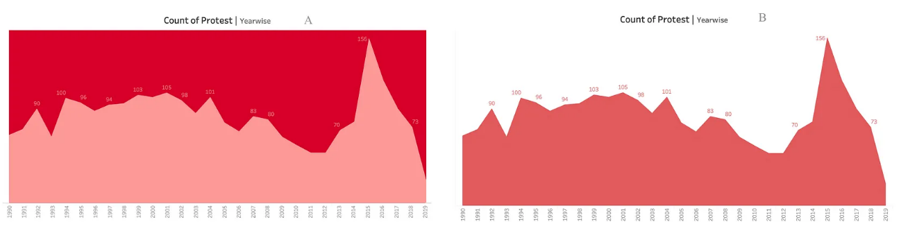
Figure 5. Chart A with low contrast requires more
cognitive effort than Chart B (source: https://medium.com/@maladeep.upadhaya)
To sum up everything, please do keep in mind that gestalt
principles are in the mind, not only in the eye. So, instead of just playing
with how we visualize data beautifully and neatly, another important part in
visualizing data is how to build the chart more appealing based on
psychological aspects.
So, what do you wait for? Create your viz now!
Penulis : Putri Prama Ananta
References:
Deep,
M. (2023) How to apply gestalt psychology principles in data visualization,
Medium. Available at:
https://medium.com/nightingale/how-to-apply-gestalt-psychology-principles-in-data-visualization-6242f4f1a3de
(Accessed: March 27, 2023).
Nurzal,
E.R. (2021) 6 prinsip gestalt Yang Dapat Anda Gunakan untuk memudahkan Audiens
Anda Dalam memproses visualisasi data, Presenter Map. Available at:
https://erry-ricardo.com/2021/08/30/6-prinsip-gestalt-yang-dapat-anda-gunakan-untuk-memudahkan-audiens-anda-dalam-memproses-visualisasi-data/#.ZCEDc3ZBzrf
(Accessed: March 27, 2023).
Shikhrakar,
S. (2021) 7 gestalt principles of design [infographics included],
ux360.design. Available at: https://ux360.design/gestalt-principles-design/
(Accessed: March 29, 2023).
| Disclaimer |
|---|
| Tulisan ini adalah pendapat pribadi dan tidak mencerminkan kebijakan institusi di mana penulis bekerja. |